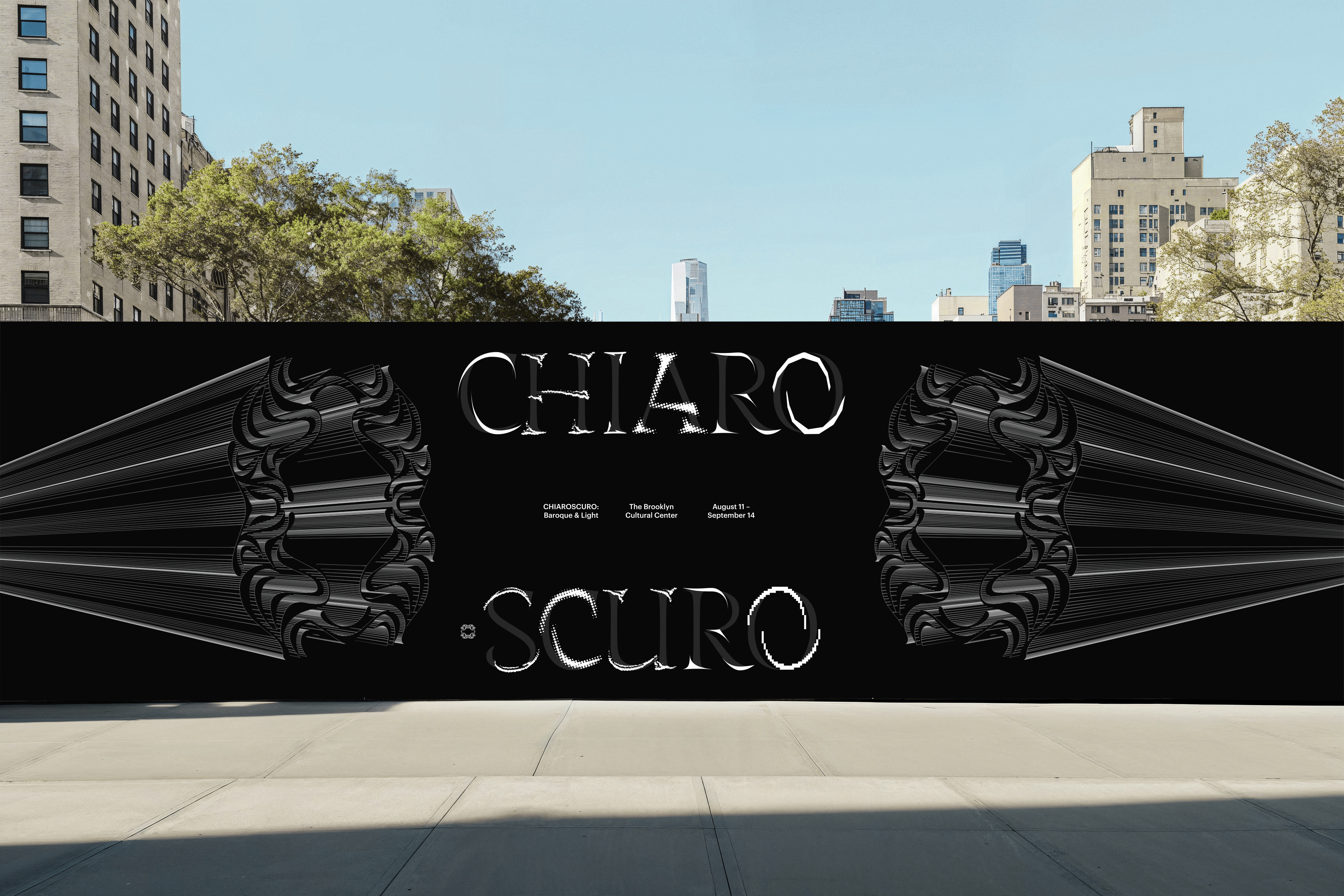
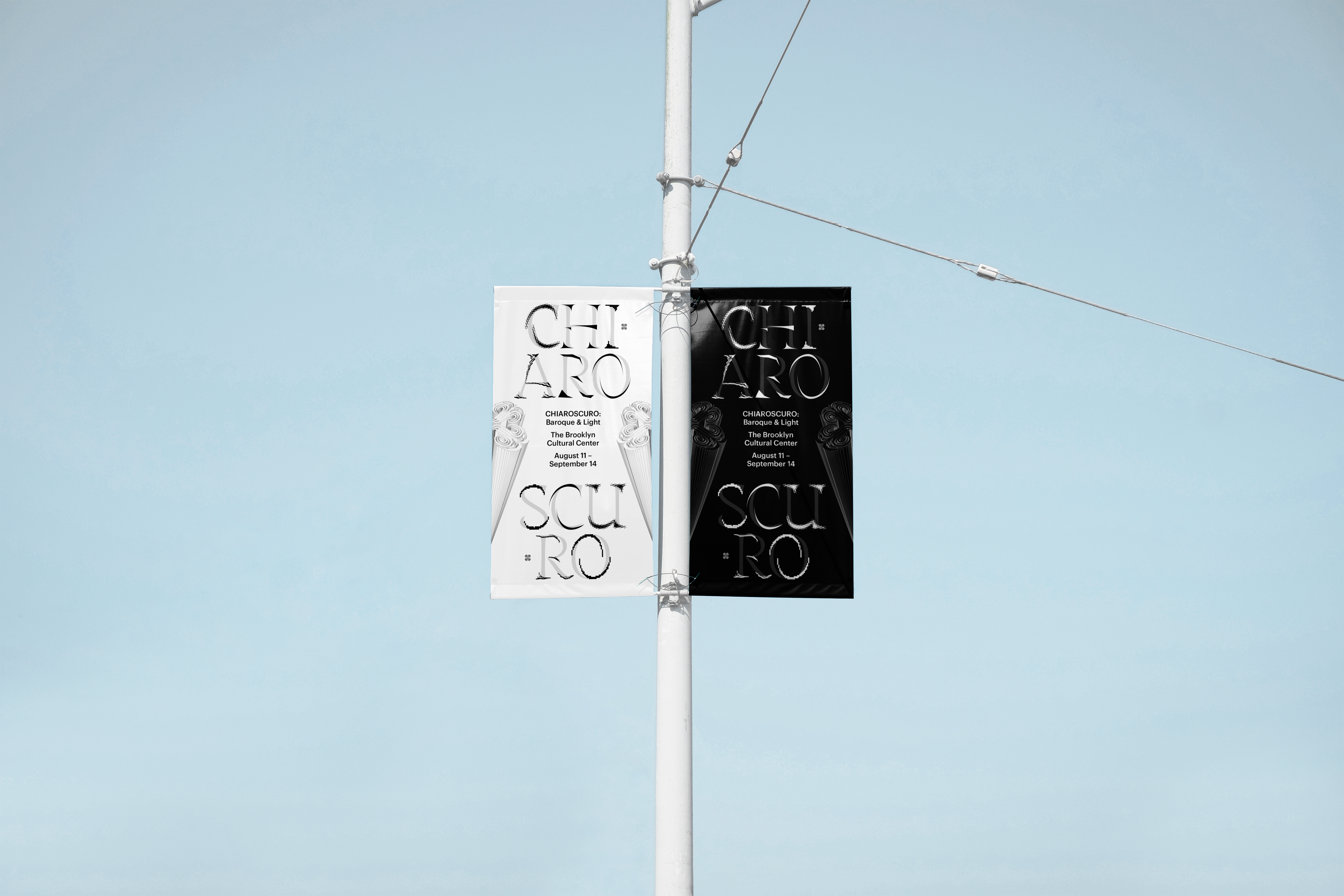
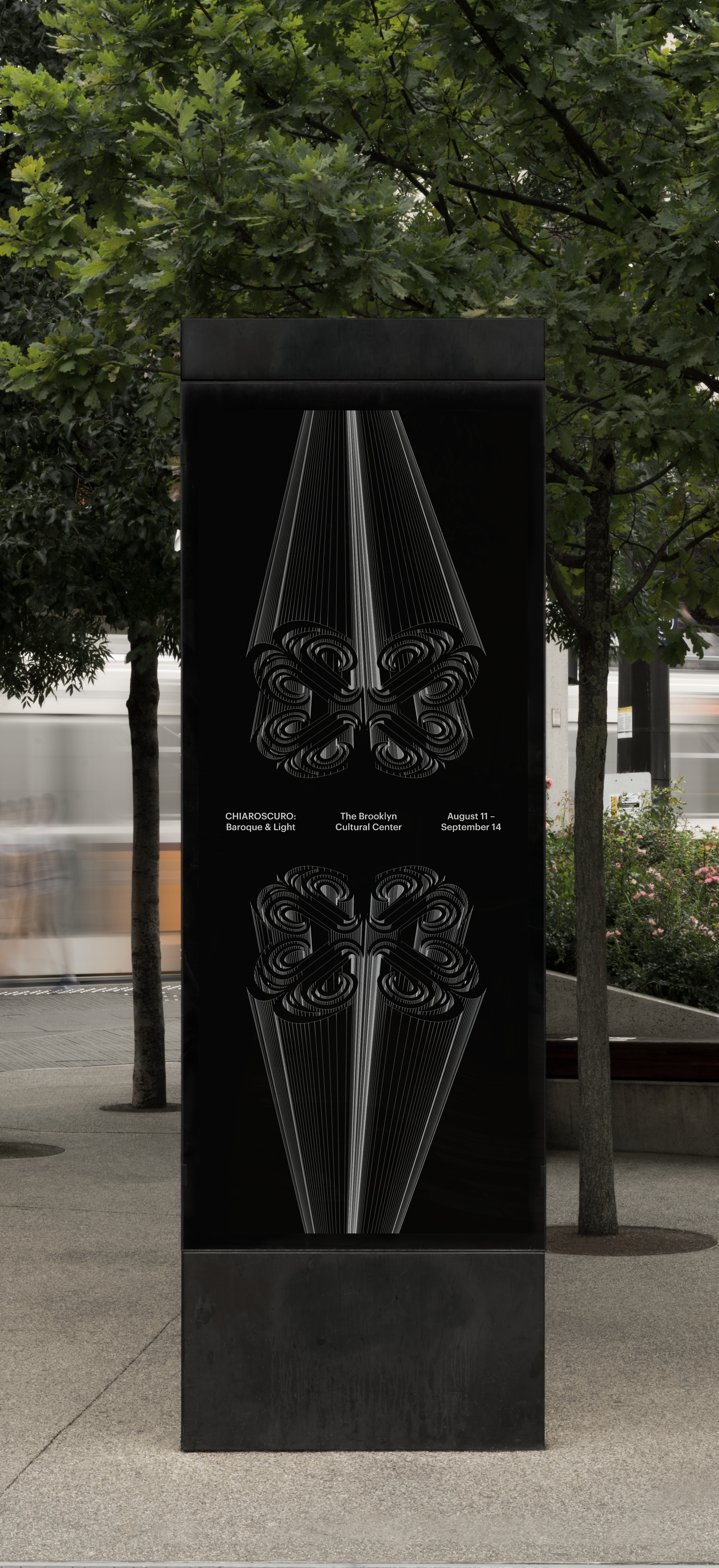
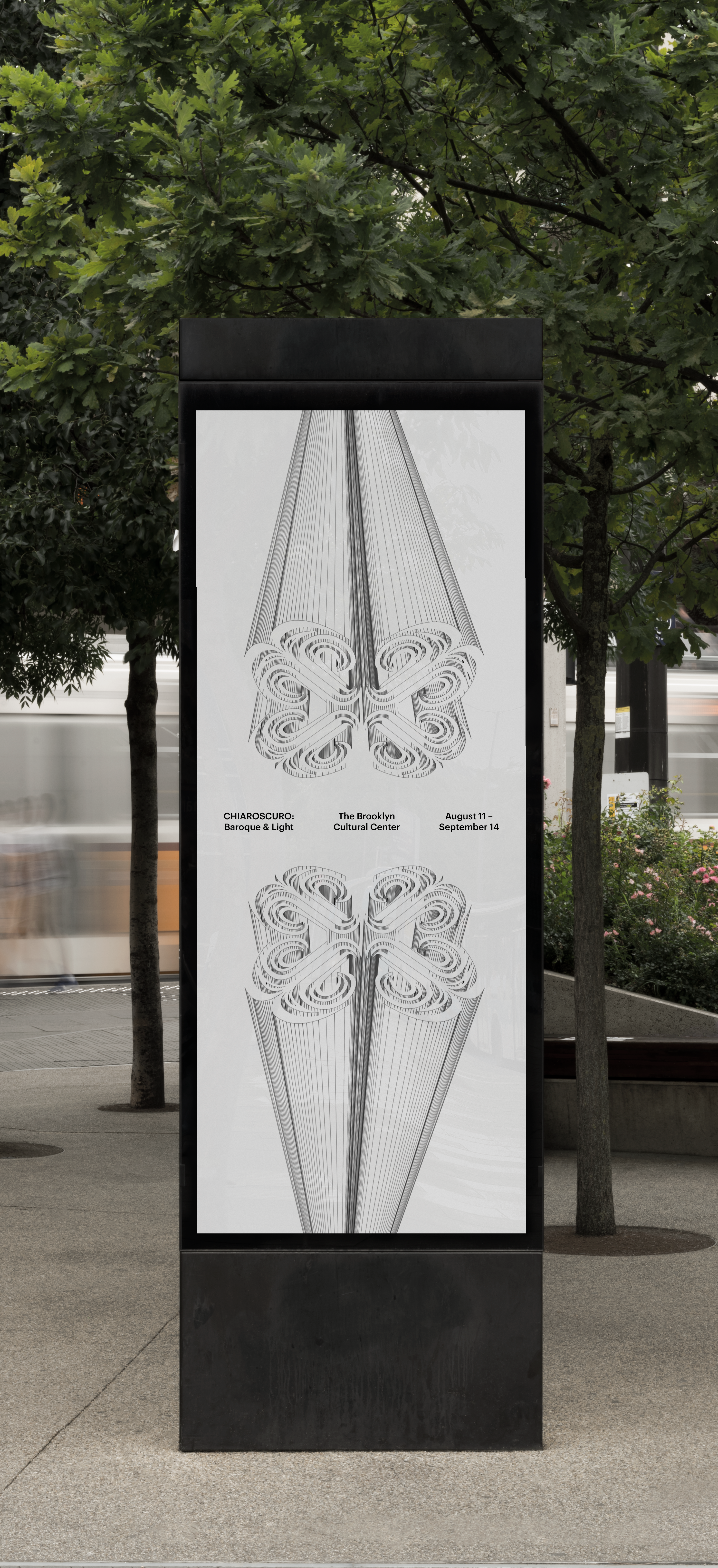
CHIAROSCURO:
Baroque & Light
Visual Identity | Type Design | Motion Design | 3D
CHIAROSCURO: Baroque & Light is an art exhibition celebrating Baroque art’s mastery of chiaroscuro, the technique of establishing dramatic contrasts between light and dark to evoke emotion and heighten visual drama.
The exhibition's visual identity captures the interplay of light and dark in chiaroscuro. A custom display type binds both sides of the chiaroscuro duality, establishing a sense of drama and grandeur characteristic to Baroque art. Additionally, ornate icons, inspired by Baroque embellishments and light's falloff, create depth and guide attention to key moments.
Ornamentation — Typographic Accents
Six distinct typographic accents capture the chiaroscuro interplay of light and dark, layering over base text styled in the opposing chiaroscuro shade to create captivating contrast.
Ornamentation — Iconography
Three icons support directing the eye to key content. Their form draws from Baroque embellishments and the falloff of light.
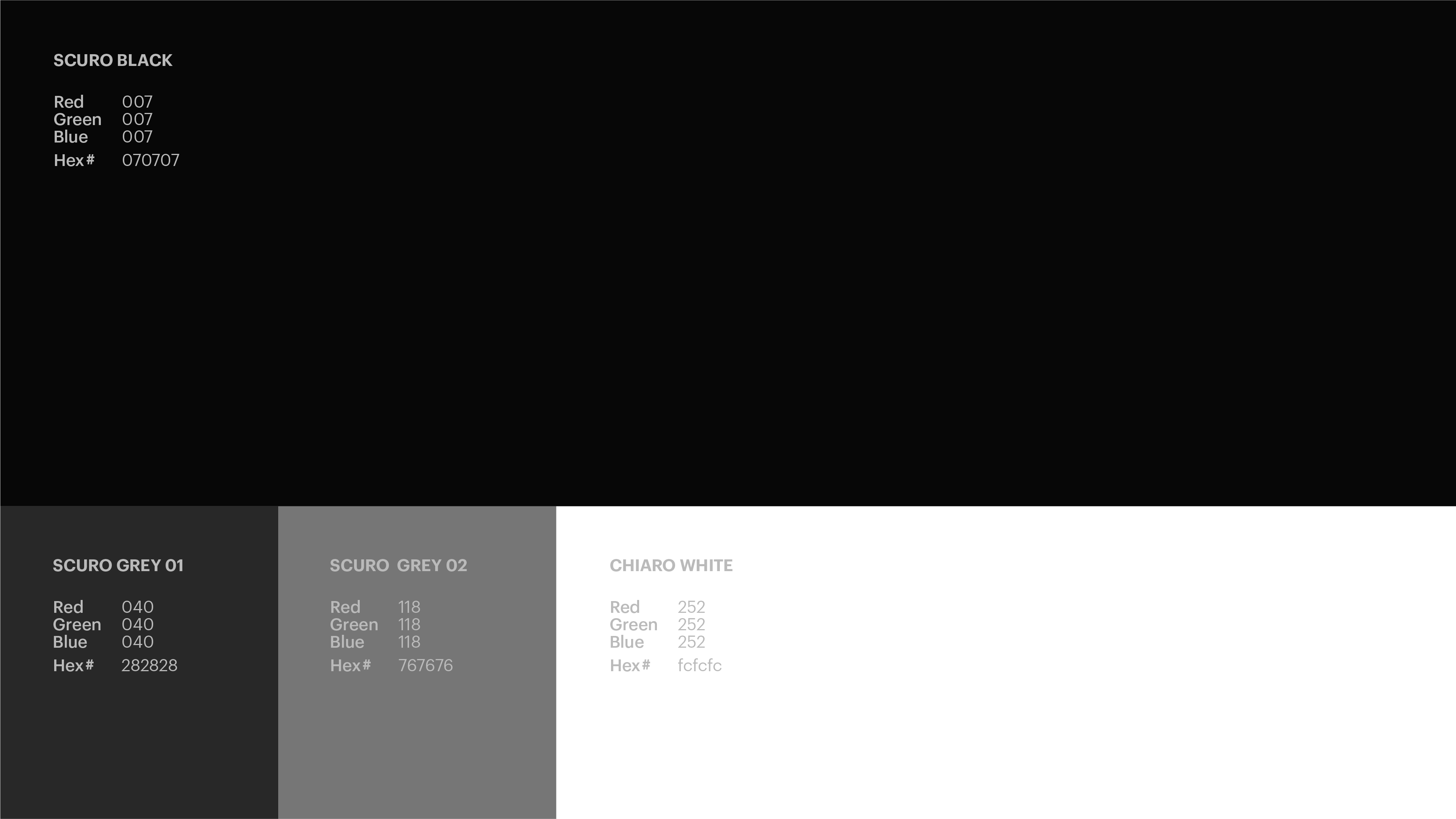
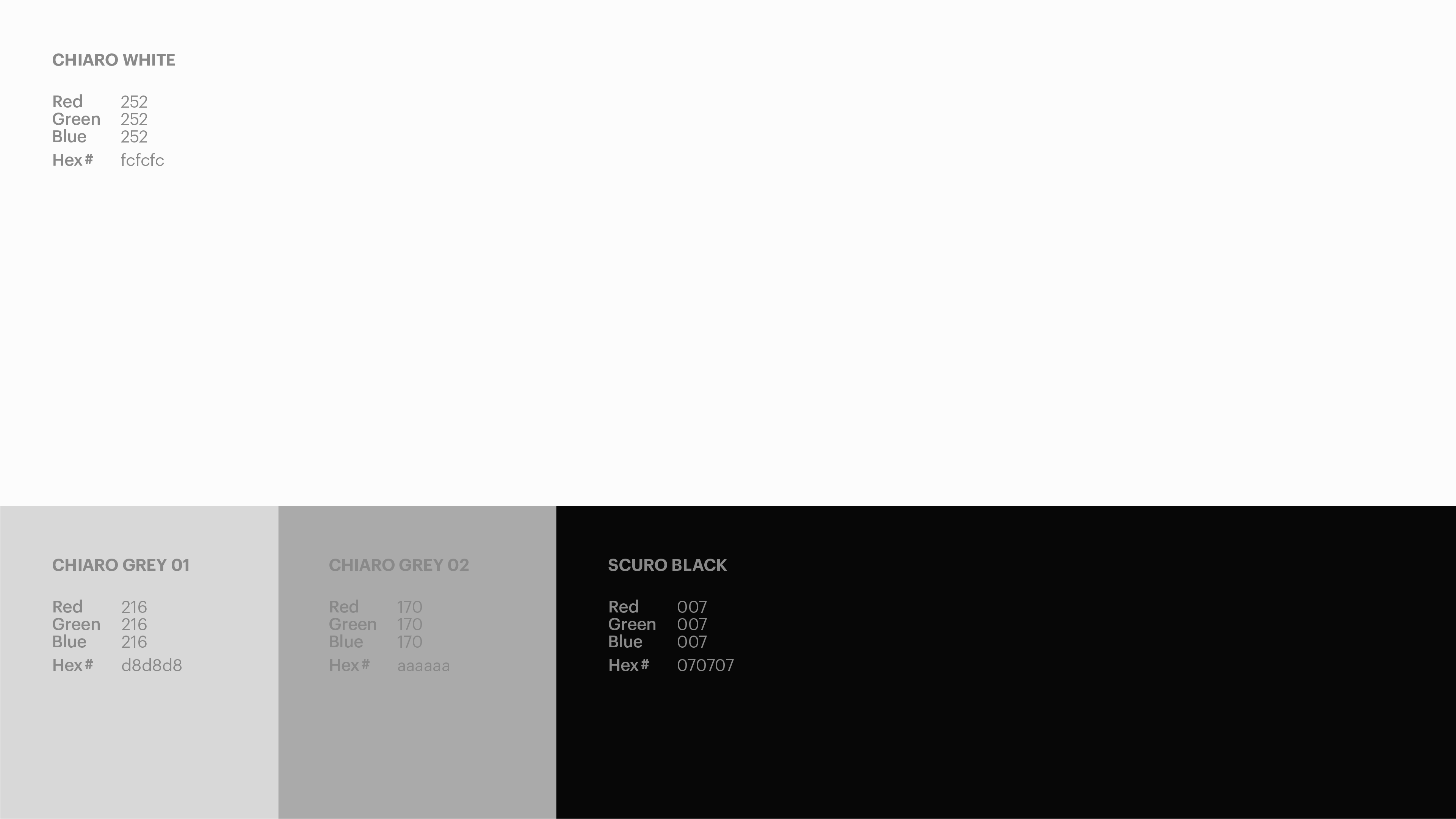
Color Palette
The chiaroscuro light and chiaroscuro dark color modes transition thoughtfully throughout the visual identity to create visual drama.
Chiaroscuro — Dark
Chiaroscuro — Light
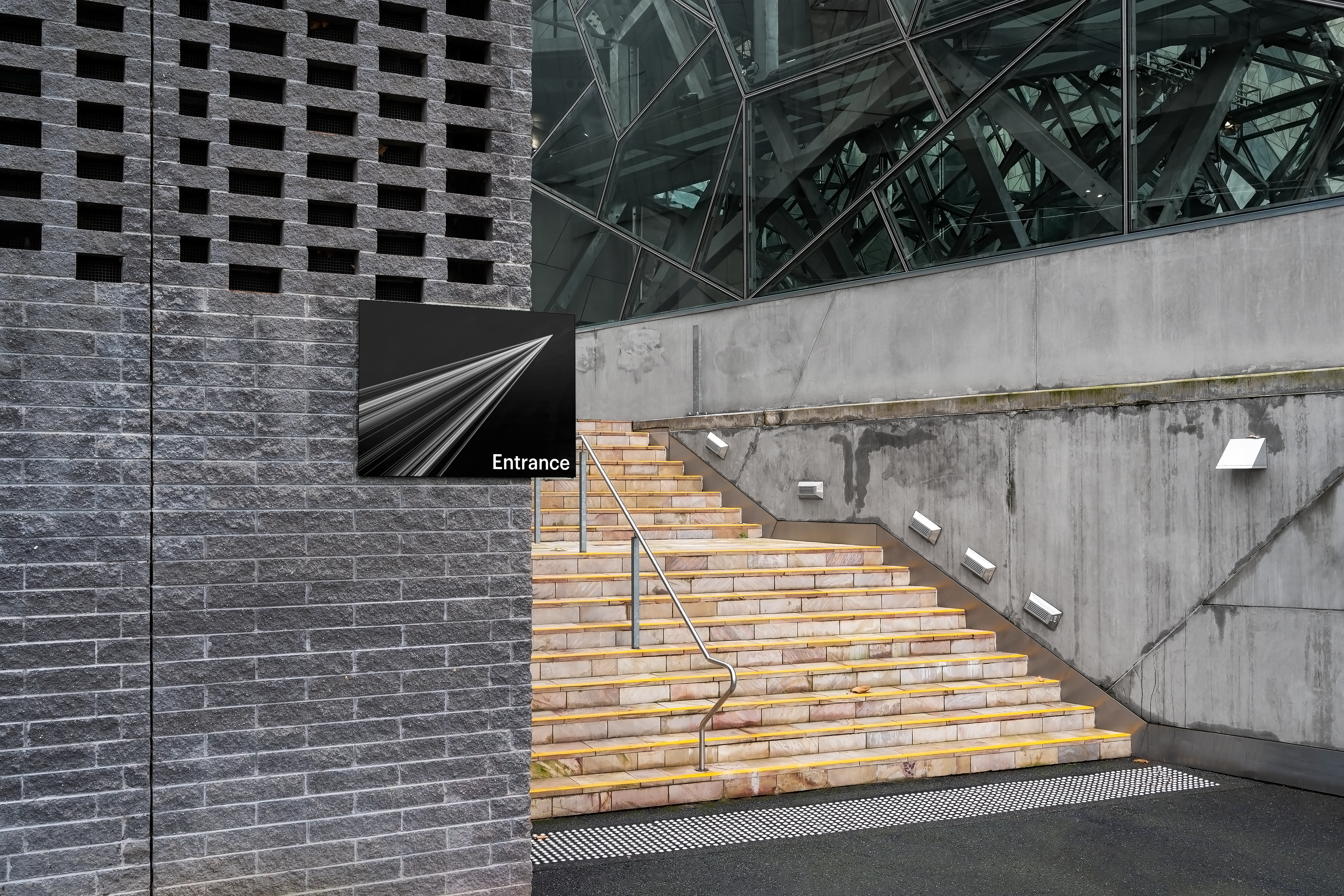
Applications
Digital

Out of Home